
Website Click To Action: Tips to Improve Your Conversion Rates
These tips will improve the design of your website’s call-to-action (CTA) and encourage users to take action. By following a goal-oriented CTA design, you can better understand your users’ behavior and create an effective strategy.
There are various types of CTAs, such as:
- Book Now
- Free Trial
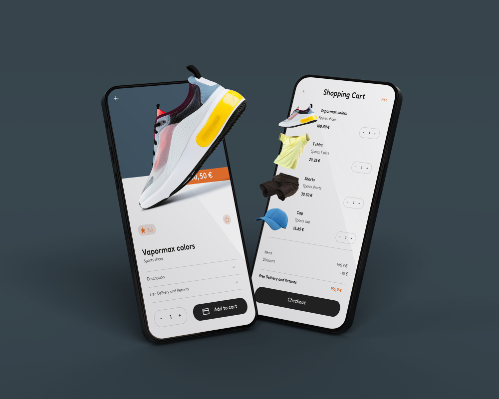
- Add To Cart
- Donate
- Book Appointment
- Sign Up
- Learn More
- Download
MAXG analyzed 618 different call-to-action (CTA) examples. The data set includes a wealth of information accumulated over decades, a significant period of time, as shown below.

Which call-to-action (CTA) had the best performance?
“Interestingly enough, our link CTAs converted at a much higher rate, 7.72%, but then failed to deliver the submission, turning only 26.8% of the visitors to the landing page into new leads. Our button CTAs converted at 2.65% and only turned those clicks into leads 16.9% of the time; they were by far the worst-performing type for us.
Our image CTAs (graphically designed images used as CTA links) converted at a 2.96% rate, very close to our average, but drove the highest conversion, at a staggering 56.6%.” – MAXG“
Recognizing which elements align seamlessly with the design of your landing page is essential, as it generally connects to the overall theme of the website. For example, if you run a hotel, the main goal for visitors would likely be booking a room. Fortunately, there are techniques to improve your website’s performance.
Step 1: Be Intentional with Color
For an effective CTA call-to-action button, it should be prominent and eye-catching while avoiding a flashy, tacky or unprofessional appearance.
To make the CTA button stand out while still appearing professional, it’s important to find the right balance between color and size.
For example: for larger buttons or icons, it’s best to use a color that complements the overall website design. For smaller buttons, a more vibrant color can be used to draw attention to it.
Additionally, you can use color to indicate priority. For example, if you have two CTAs, one for more information and one for donation, you can use a brighter color to highlight the donation button. To create contrast and draw attention to the CTA, you can make it the only element in focus on the page and have the background slightly faded or blurred.
Step 2: Have good spacing.
The positioning and use of white space are important elements in making your call-to-action (CTA) button effective. Here are some basic guidelines:
Position: CTAs perform well when placed “above the fold,” which refers to the portion of a website that is visible without scrolling. If you are not a graphic designer, or even if you are, you can figure out the fold on your website, you can determine the fold on your website by using online tools such as this one HERE.
The term “above the fold” originates from the newspaper industry back in the early days of the press, where the most important photos were placed in this area to capture readers’ attention.
Long layout landing pages with multiple CTA placements can generate up to 220% more leads than landing pages with CTA only above-the-fold (wordstream)
Multiple CTAs: having multiple call-to-action (CTA) buttons on a landing page is more effective than having just one. This allows you to provide more detailed information about the offer and add personalization. A well-designed landing page with 1-3 CTAs is more conversion-focused. Keep in mind that testing different CTA placements and designs can yield surprising results.
White space: in addition to positioning, it’s important to consider the use of white space around the CTA button. This empty space helps the CTA stand out and effectively communicate its message. Avoid overcrowding the CTA and make sure it has enough room to be easily seen and clicked.
Step 3: Icons and Text
We just went through how important having white space surround a CTA is. However, while white space is important, sometimes it may be necessary to include an image, icon, or text to draw attention to your call-to-action (CTA) button.
This is particularly important when the CTA does not fit seamlessly into the page design. To make the CTA as effective as possible, it’s important to use simple, clear language and to be as concise as possible.
Short phrases such as “click here,” “book now,” or “download free” are effective, as are icons that convey the meaning of the CTA, such as a computer for a download or a plane for booking a flight.
Additionally, it’s worth noting that people are more likely to read the text before a button, so including a few bullet points as an explanation can be helpful to clarify the offer.
Step 4: A/B Testing
The tips above can definitely put you on the right track, but nothing helps are much as an actual test in the market. Testing is key to understanding your specific audience’s buying pattern and behavior. Every service/product buying process looks different, especially for different industries. Check out how VWO prioritizes CTA testing:
The tips above can guide you in the right direction, but testing in the real market is the best way to truly understand your audience’s behavior and buying patterns. Every service or product’s buying process is unique, especially across different industries. To gain insights on how to prioritize CTA testing, it’s worth looking at how VWO does it.
If the above is too complicated, check out this tool to create an A/B test to see which design works best for you.
Step 5: Be Transparent in your Privacy Policy
Privacy is a significant factor in building trust with users, especially for strangers visiting your website. By displaying your privacy policy below the CTA button, you can immediately assure users that their information is protected and that they can opt out at any time.
This improves the credibility of your offer and can potentially boost your SEO. However, it’s important to note that this might not directly impact your rankings.
In the case of a manual review by Google, having a privacy policy in place can be beneficial. But it’s essential to ensure that the link or statement about privacy policies doesn’t distract from the main message or negatively affect the performance of the CTA. Keep it simple, clean, and in line with your overall design strategy.
Step 6: Create Urgency
The internet is full of distractions, and it can be hard to get users to take action immediately. Creating a sense of urgency, such as a limited-time offer, can be an effective way to motivate users to act quickly. Even if the offer is available for weeks, the fear of missing out (FOMO) can be a powerful motivator.
Urgency can also be created by offering something for free, such as a checklist, ebook, video tutorial, email course, or logo sneak peek, that your audience finds valuable.
Creating an urgency to not miss out on a special opportunity can increase engagement and awareness for those customers looking for instant satisfaction. Some examples of urgent CTA words include
“Start Now,”
“Activate Today,”
“Don’t Miss Out,”
“Claim your…Now,”
“Buy Now to Avoid Missing Out.”
Step 7. Social Media Sharing CTAs
While some blogs, products, or services are specifically designed to go viral, it can’t hurt to try even if it’s not your brand’s main goal.
There are various ways to achieve this, such as by including social sharing options after conversions are made, incorporating funny or engaging content that users want to share on their own social media, after the transaction is made.
Examples can be adding a funny meme to the “Thank you page,” or confirming a donation was made, or a tree was planted thanks to their purchase. Anything interesting enough to your audience worthy of sharing in their social community, increasing awareness of your brand and incentivizing users to stay connected with you in social channels.
According to ActiveCampaign, there are three main types of social sharing CTAs: social icons linking to your social media pages, social shares on the sidebar of posts, and in-line sharing CTAs. Consider trying out one or more of these options to increase engagement on your website.
In conclusion, it may be worth trying one or two of these strategies at a time, so you can start to understand what works best for your business and what works best with your target audience.
Which one will you try?